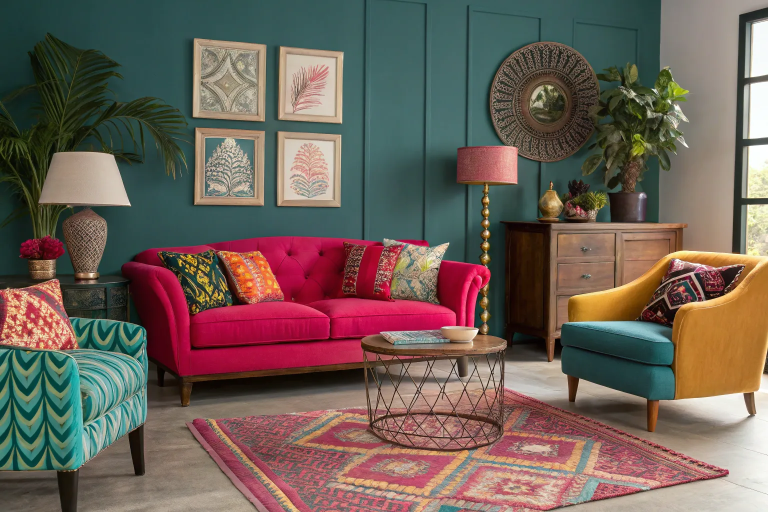
Color has the extraordinary ability to transform both our spaces and our moods. I’ve witnessed countless transformations where thoughtful color choices elevated ordinary rooms into vibrant, personality-filled havens that owners genuinely love spending time in.
Understanding Color’s Impact on Your Space
The Psychology Behind Bright Colors
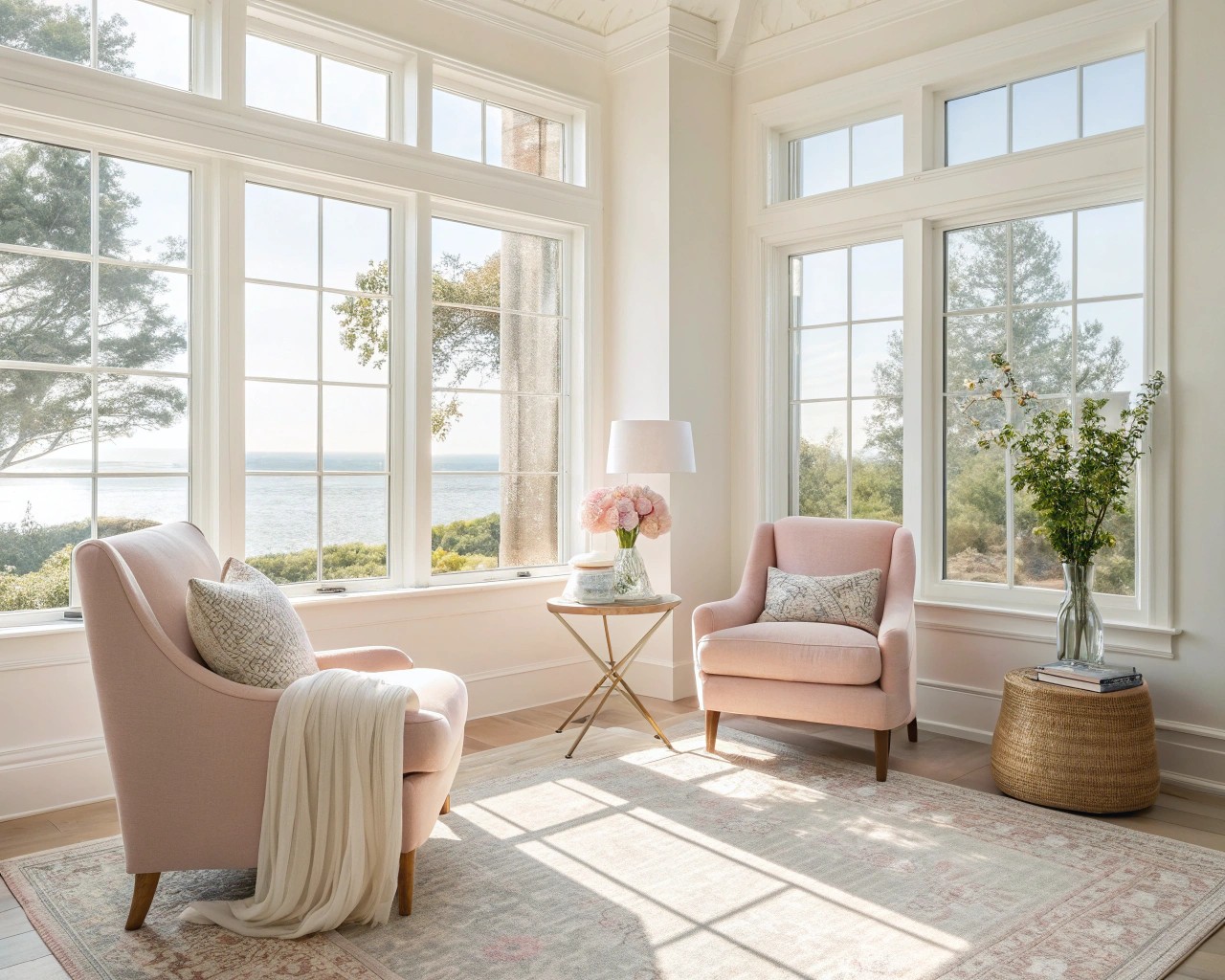
Color psychology reveals that different hues trigger distinct emotional responses in our minds and bodies. Warm colors like reds, oranges, and yellows stimulate energy and create inviting atmospheres, while cool blues and greens promote tranquility and focus. Research demonstrates that people experience measurable changes in mood and cognitive function when surrounded by different color palettes, making your color choices far more significant than simple aesthetic preference.
The key lies in understanding how color affects spatial perception. Light colors reflect more wavelengths, creating the illusion of expanded space, while darker hues absorb light and can make rooms feel intimate and cozy. When strategically applied, bright accents work as visual anchors that draw attention and create focal points without overwhelming the senses.
Color Temperature and Its Role
Color temperature, measured on the Kelvin scale, significantly influences how we perceive our environment. Warmer colors (2700K-3000K) emit cozy, yellowish light that enhances red and orange tones, while cooler temperatures (4000K-5000K) provide crisp, blue-white light that amplifies cool colors and creates energizing environments.
Practical Application: In rooms with abundant natural light, cool-toned bright colors like turquoise or lime green maintain their vibrancy throughout the day. Spaces with limited natural light benefit from warm-toned brights like coral or golden yellow, which appear rich and inviting under artificial lighting.
Mastering Color Theory for Room Design
The Essential Color Wheel Relationships
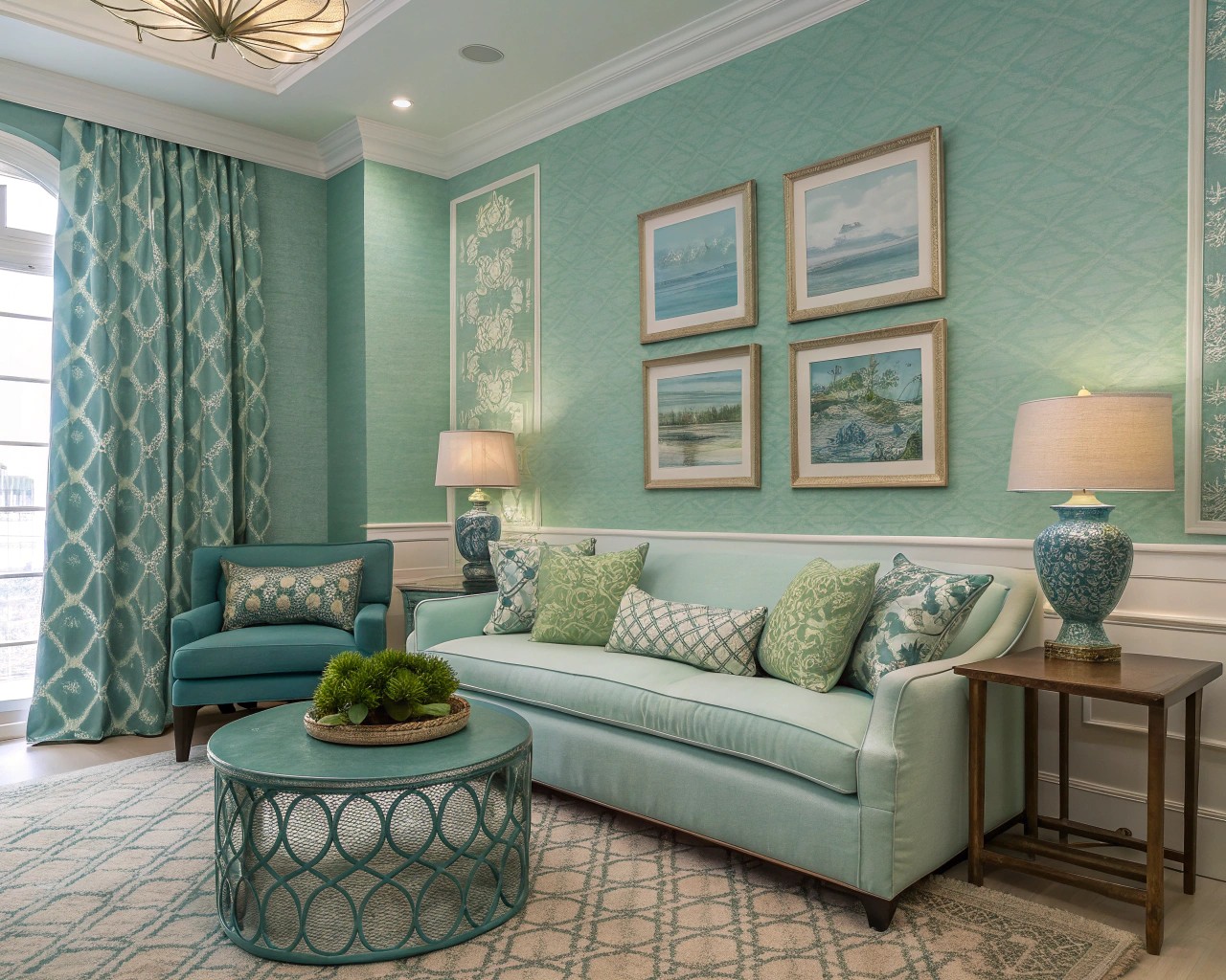
Understanding color relationships provides the foundation for successful bright color integration:
| Color Scheme | Description | Best Application | Example Combination |
|---|---|---|---|
| Complementary | Colors opposite on the wheel | High-impact accent walls | Orange walls with blue accessories |
| Analogous | Adjacent colors on the wheel | Harmonious, calming spaces | Yellow-green, green, blue-green |
| Monochromatic | Variations of single hue | Sophisticated, unified look | Light blue, navy, royal blue |
| Triadic | Three equally spaced colors | Vibrant, balanced energy | Red, yellow, blue accents |
Complementary colors create high contrast and visual excitement, making them perfect for statement walls or bold furniture pieces. Analogous schemes offer gentle harmony and are often found in nature, creating calming environments. Monochromatic approaches provide sophisticated unity while allowing for subtle depth through varied tints and shades.
The 60-30-10 Color Formula
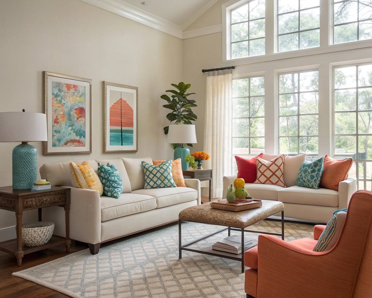
This professional color distribution ensures balance while allowing bright colors to shine:
- 60% – Dominant neutral base (walls, major furniture)
- 30% – Secondary supporting color (upholstery, window treatments)
- 10% – Bright accent color (accessories, art, pillows)
Professional Tip: When introducing bright colors, start with the 10% accent percentage. This allows you to experiment with bold hues without committing to large-scale changes, and you can always increase the proportion once you’re confident in your color choices.
Practical Strategies for Adding Bright Colors
Start Small, Think Strategic
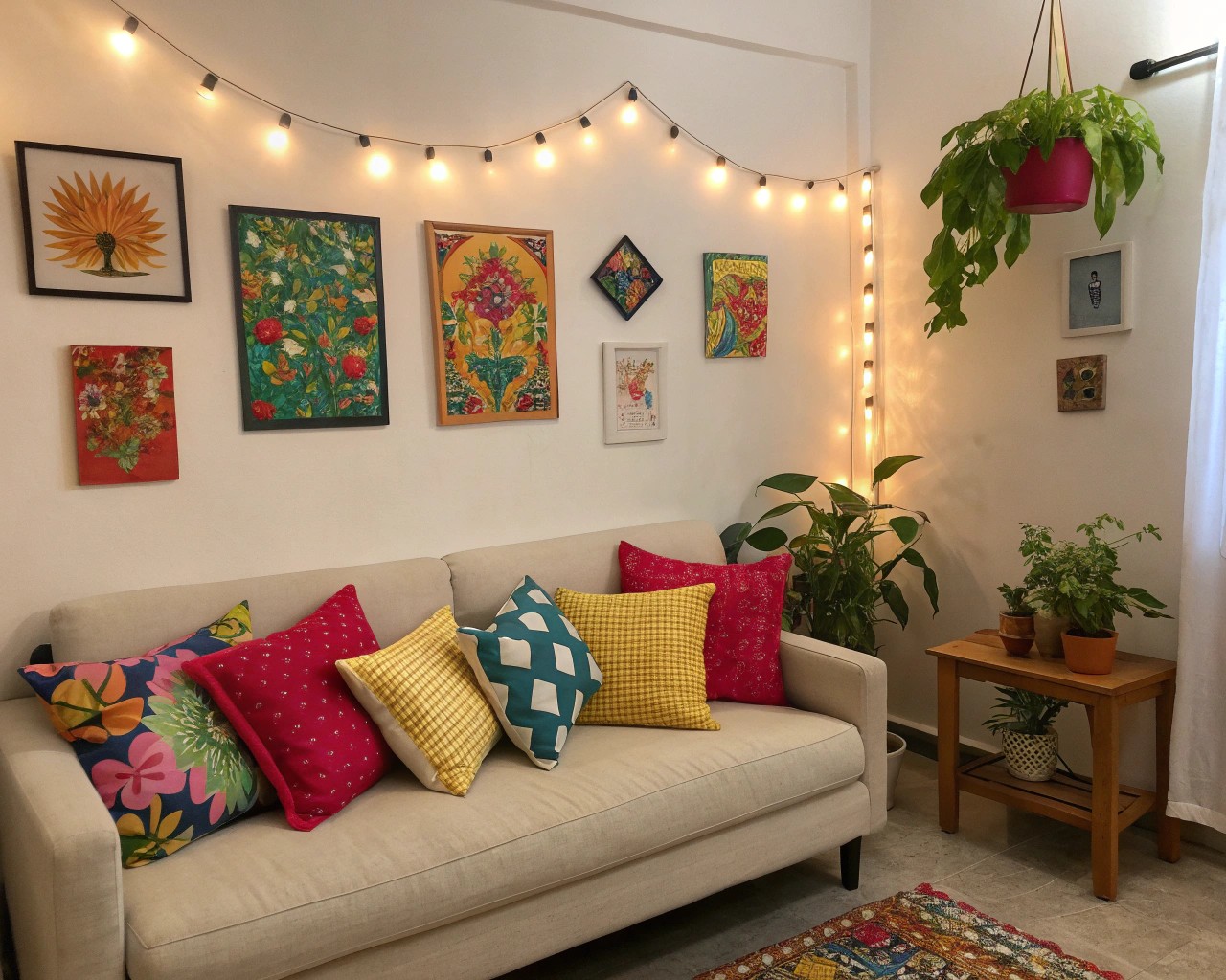
The most effective approach to incorporating bright colors involves strategic placement rather than overwhelming saturation. Begin with easily changeable elements that provide maximum impact:
High-Impact Accent Pieces:
- Throw pillows in vibrant jewel tones
- Colorful area rugs that anchor seating areas
- Bold artwork that creates visual focal points
- Fresh flowers in bright ceramic vases
- Colorful lamp bases or sculptural lighting
The Power of Repetition
Professional designers rely on the “rule of three” – repeating accent colors at least three times throughout a space creates visual cohesion. If you introduce bright yellow through a throw pillow, echo it with yellow flowers and a yellow spine on a coffee table book. This repetition creates intentional design flow rather than random color placement.
Unexpected Color Placement
Some of the most delightful color applications occur in surprising locations:
- Paint interior cabinet doors in bold hues for hidden surprises
- Add colorful wallpaper to closet interiors
- Install bright backsplashes behind open shelving
- Paint ceiling beams or architectural details in accent colors
- Choose colorful hardware for furniture and cabinetry
Room-by-Room Color Applications
Living Spaces: Creating Social Energy
Living rooms benefit from colors that encourage conversation and create welcoming atmospheres. Warm oranges, energetic corals, and sophisticated burgundies work exceptionally well in social spaces.
Implementation Strategy:
- Use neutral furniture as your foundation
- Introduce color through easily changed textiles
- Create seasonal flexibility with interchangeable accessories
- Balance bright colors with natural materials like wood and stone
Small Spaces: Maximizing Impact
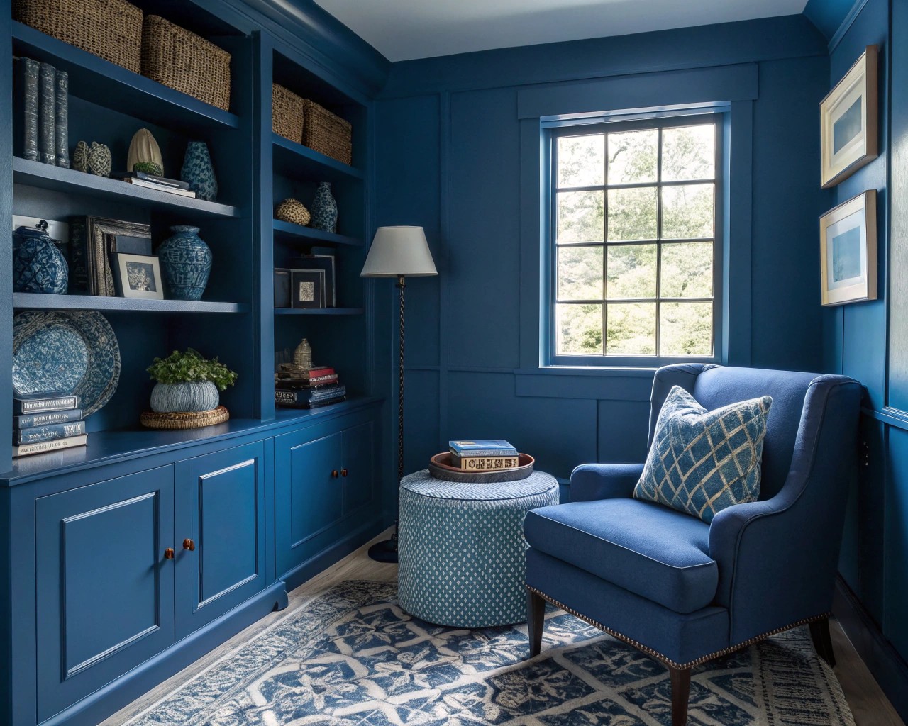
Contrary to traditional advice, small spaces can handle bold colors exceptionally well. The key lies in unified color application that eliminates visual fragmentation.
Small Space Strategies:
- Use monochromatic bright schemes for cohesion
- Paint ceilings the same color as walls to eliminate visual breaks
- Choose one bold color and vary its intensity through tints and shades
- Incorporate metallic accents to reflect light and add sparkle
Colors like Benjamin Moore’s Abalone, which shifts between grayge with lavender touches, work beautifully in compact spaces by adding sophistication without overwhelming. Similarly, Sherwin Williams’ Silver Strand brings spa-like tranquility while bouncing light around tight quarters.
Seasonal Color Integration
Rather than completely redecorating each season, build a neutral foundation that accommodates seasonal color changes through accessories and textiles.
Seasonal Color Framework:
Spring: Fresh greens, soft yellows, and gentle pinks create renewal energy
Summer: Cool blues, bright whites, and coral tones evoke refreshing vibes
Fall: Warm oranges, rich burgundies, and deep golds create cozy atmospheres
Winter: Jewel tones, metallic accents, and rich textures add warmth and luxury
Working with Natural and Artificial Light
Understanding Light’s Effect on Color
Color appearance changes dramatically based on lighting conditions. What appears vibrant in morning sunlight may look dull under evening incandescent bulbs. North-facing rooms benefit from warm colors to counteract cool natural light, while south-facing spaces can handle cool colors without appearing cold.
Professional Application: Test color choices at different times of day and under various lighting conditions before making final decisions. Use warm LED bulbs (2700K) to enhance red and orange tones, and cool LED bulbs (4000K) to make blues and greens appear more vibrant.
Budget-Friendly Bright Color Solutions
High-Impact, Low-Cost Options
Transform your space without breaking the budget through strategic color placement:
Paint Projects:
- Single accent walls create drama for minimal cost
- Paint existing furniture in bright colors for instant updates
- Use painter’s tape to create geometric color patterns
- Paint interior doors for unexpected color surprises
Textile Solutions:
- Bright throw pillows offer the biggest impact per dollar
- Colorful area rugs anchor spaces and define color schemes
- Window treatments in bright colors transform room atmosphere
- Table runners and placemats add seasonal flexibility
Shopping Strategies for Colorful Decor
Time purchases strategically by shopping end-of-season sales for next year’s color updates. Browse thrift stores and consignment shops for unique colorful pieces, and check clearance sections for discontinued bright color items. Consider online marketplaces for gently used colorful furniture that can be refreshed with new bright accents.
Advanced Color Techniques
Color Blocking for Impact
Color blocking involves using solid blocks of contrasting colors to create bold, graphic statements. This technique works particularly well in modern and contemporary spaces, where you can paint lower and upper wall sections in contrasting colors or use bright furniture against neutral walls for definition.
Avoiding Common Mistakes
The most common mistake involves using too many bright colors simultaneously without proper balance, creating visual chaos rather than intentional design. Limit bright colors to 2-3 maximum per room, use neutral backgrounds to ground bright accents, and vary color intensities rather than using all full-saturation hues.
Creating Your Personal Color Strategy
Before diving into bright color additions, understand your personal color preferences through self-assessment. Consider which colors make you feel energized versus calm, whether you prefer warm or cool color temperatures, and how much visual stimulation you enjoy in your daily environment.
Develop a cohesive color strategy that flows throughout your home by choosing a connecting neutral that appears in every room, selecting 2-3 bright accent colors for your overall palette, and building in seasonal flexibility through easily changed accessories.
The journey of adding bright colors to your home should bring joy and reflect your personal style. Remember that color choices are deeply personal, and what energizes one person may overwhelm another. Trust your instincts, start small, and build confidence through experimentation. Your home should be a place where you feel comfortable, inspired, and genuinely happy to spend time.
(

